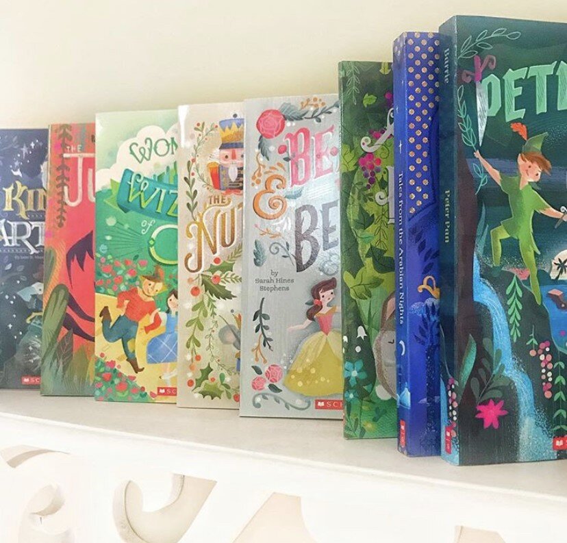
Over the past 5 years, I have had the honor to work with the great folks at Scholastic on a series of re-designed classics book covers for the Scholastic Reading Club. From Alice in Wonderland to Little Women (with 15 covers in between!) this entire series has been a joy to work on. Anytime you can combine lettering with characters, not to mention on a product that gets great affordable literature into young hands, is a win.
On all of these covers, the parameters were fairly open, other than the top consideration that it reduces to thumbnail size clearly with good contrast for optimum readability.
Here are some initial pencils on the first title I worked on (and still one of my favorites) Alice in Wonderland. The book was to include a pocket watch pendant, so I incorporated the watch into the lettering in some of the sketches. Option 3 was chosen, with the caveat that Alice needed to be aged up. Simply lengthening her torso, cinching and lowering the waist and bingo, you have a tween Alice!
When going to color, I went with a dark background which ended itself to her mysterious decent into Wonderland as well as providing contrast and readability for the title. Favorite part? Angry flowers, of course!


