Miriam Bos's the Hidden Garden Collection for Birch Fabrics

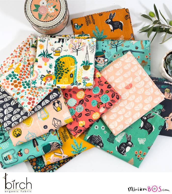
I am so happy to announce that the Hidden Garden collection made with Birch Fabrics is finally open for orders.

Last year Birch Fabrics approached me to create a fabric collection inspired by ‘The Secret Garden’. A classic novel (1910) by Frances Hodgson Burnett. It’s a beautiful story about the friendship of a girl and two boys, who find a secret garden and work hard to make it bloom again. Of course, this is only a very modest summary.  I’d love to encourage you to read it some time, if you don’t know it yet.

I was listening to the book when I was working on this collection, and it literally got me in the mood. It’s been such a dream project to work on. I love working with Birch Fabrics. These are real kind people who put great effort and love in producing beautiful fabrics.

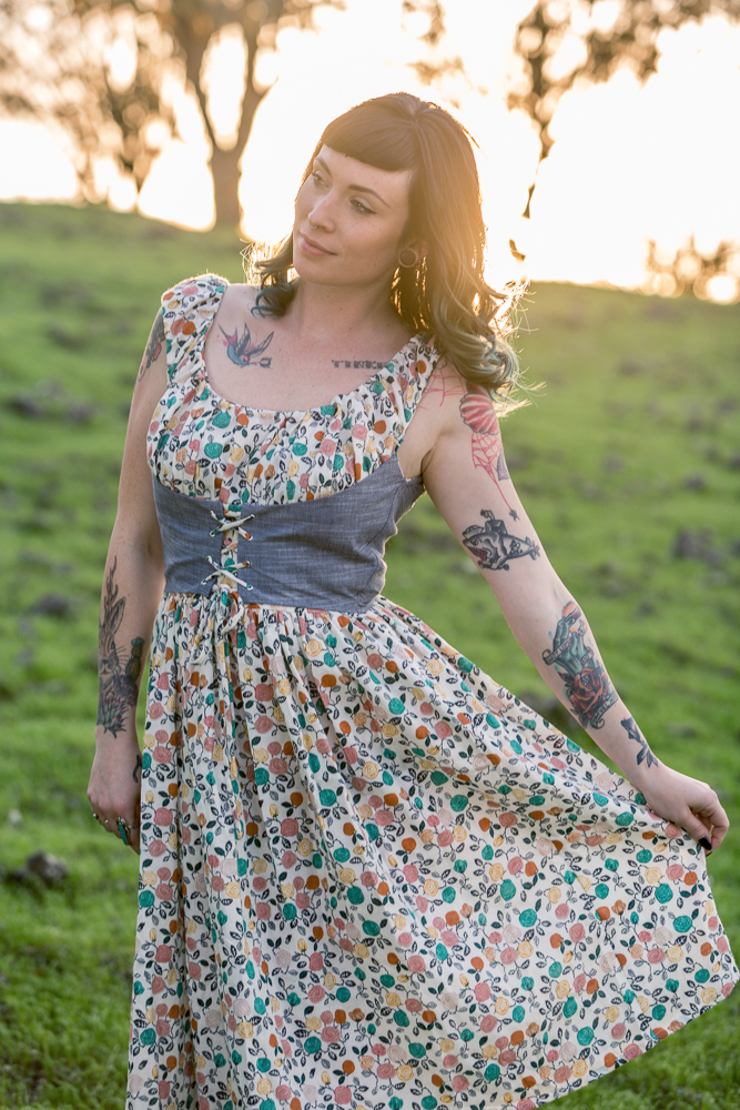
A few weeks ago Birch Fabrics attended the International Quilt Market in Houston. They shared a few photos on their Instagram account, and I loved seeing my artwork making it to actual products like onesies for baby’s, dresses, pillows, and curtains.

MiriamBos_BirchFabrics_1

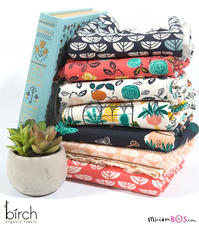
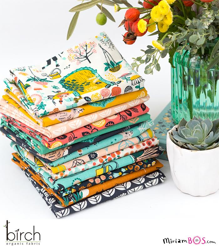
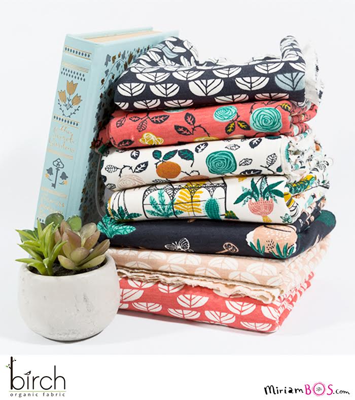
Birch Fabrics also sent me a huge box of fabrics, and I really wanted to share some photos to give you an impression of their beautiful and intense colors and detail. I love the quality of their fabrics.

The fabrics are online available at Fabricworm.com and on the website of Birch Fabrics. Birch Fabrics also wrote a lovely blog about the collection!

Scroll through the gallery below for more imagery.

Enjoy - Miriam  

MiriamBos_BirchFabrics_2
MiriamBos_BirchFabrics_3
MiriamBos_BirchFabrics_4
MiriamBos_BirchFabrics_5
MiriamBos_BirchFabrics_6
MiriamBos_BirchFabrics_7
MiriamBos_BirchFabrics_8
MiriamBos_BirchFabrics_9
MiriamBos_BirchFabrics_10

The Portland Chimney Swifts

I recently got a really great commission and I wanted to share it with you. 

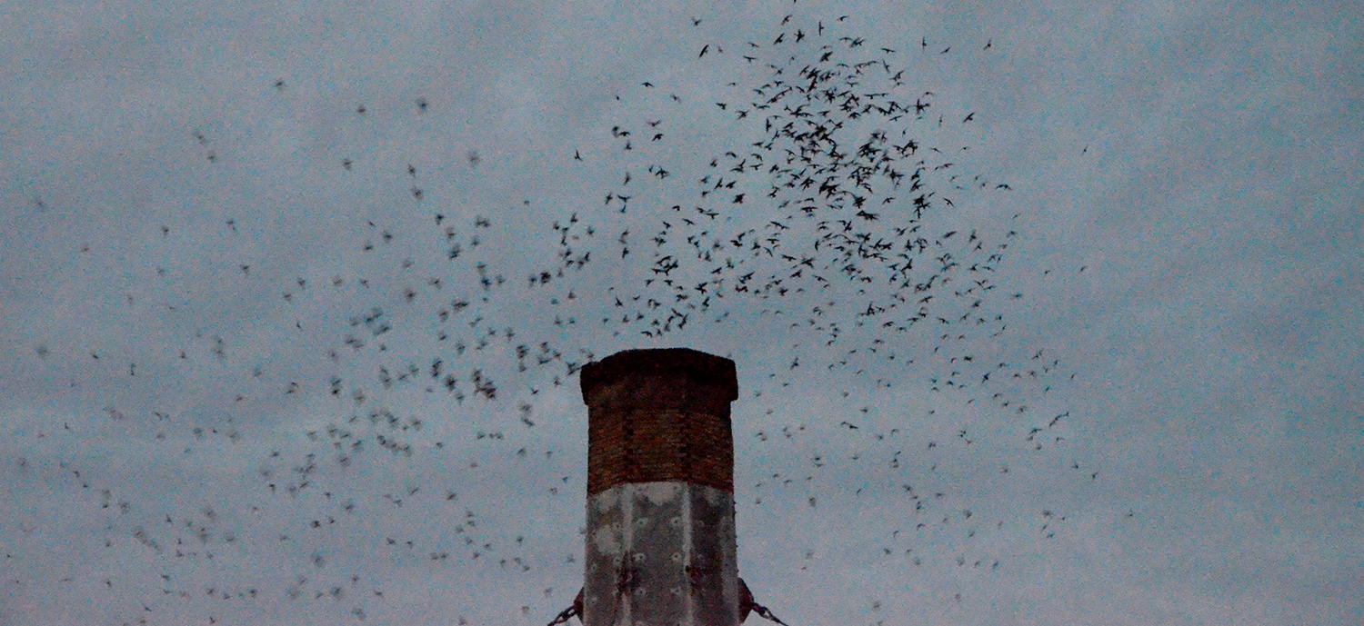
Portland hosts North Americas largest concentration of Vaux’s Swifts. Every September the birds nest in the chimney at Chapman Elementary School.  Vaux Swifts normally nest in hollowed out snags of old growth trees, but we have lost a lot of our old growth trees, and the largest population now nests in this chimney here in Portland.  In the 80’s when the birds began nesting in the chimney the school stopped using it’s heating system during the weeks of roosting.  Students and teachers wore sweaters and jackets until the end of September.  In 2003 the Audubon Society donated a new heating system to the school. Now the chimney is maintained sorely for the Swifts.  

You can imagine my excitement when I was approached to illustrate this beautiful scene.  The Swifts are a beloved Portland event, hundreds of folks gather every night in September to watch the show.  Enjoy - Anisa

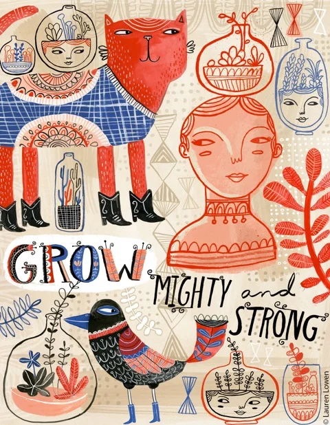
“Hey Lauren, How Do You Make Your Work?”

A long time ago (ok, not THAT long ago) I found myself pondering the same conundrum many artists do at some point (or at many points) in their lives. The question was how should I actually make my art? Hand-done with my trusty gouache or with the magic box known as the computer? And - OH - the stress! You would think I was making the most important decision in my life. Truly, it would drive me bonkers at times. 

Years ago, I was pretty much doing 95% of my work with paint. Sure, I had some Adobe Photoshop and Illustrator savvy; I had even done some client work that was all-digital to test the waters, but I was still definitely not what I would consider a “digital artist” at this point.  Even more frustrating was that my work was so flat and smooth that most people thought my gouache paintings were actually digital! It seemed to make sense that I graduate to the all mighty vector and join the modern age. In addition, my software know-how had expanded tenfold while working as an in-house designer, making me a digital ninja that could execute my work at a new level. So when I had the chance to bust out some vector work for an online class, I thought this would certainly be the turning point. My new era had begun! So I made the new piece and low and behold… I didn’t care for it that much. Sure, I probably was getting used to this new “look,” you say. However, It wasn’t that. I realized that the vector process had completely stripped away the elements that made my work look like me. As much as I tried to make my early gouache paintings super neat and smooth, I realized when comparing it to the vector piece that I actually liked all the little mistakes that happened during the painting process the texture of my brush, the lines that would vary and have funky edges. The vector work was just too perfect for me!

In college, my peers and instructors knew me as someone who was pretty confident in mark-making. My sketchbook overflowed with drawings and doodles that had energy and a wonderful messiness. I loved a good two-minute life drawing pose executed with sumi ink on a large drawing pad. Although my final projects were executed with skill, there was always something in them that was missing when compared to my sketches. Like many artists out there, I would tighten up and the freeness of my original hand would be lost to some degree. If I could just figure out how to keep the original liveliness of these sketches in my final pieces!

Naturally, I believed the solution was to work digitally. There I could preserve my sketches and work on top of them, instead of trying to emulate or duplicate them under pressure. The growing popularity of vector work out there made me believe that Adobe Illustrator and vector surely was the ideal answer, and I believed that once I started this new art chapter of my life, it would just be vector, vector, vector and I would never look back.

Oh, how wrong I was.

Fast forward to that previously mentioned vector piece for my online class. As much as I was disappointed, this process made a light bulb go off. It confirmed that I liked the texture and organic quality of paint; that I should embrace it. So instead of trying to make my future gouache paintings super perfect, I felt more confident to explore the range I could get with the medium. My process became more relaxed and exploratory as I combined loose watercolor techniques with graphic elements. And as I continued to grow my digital knowledge at my designer position, I decided that I didn’t have to choose one method. Instead, I could start to combine techniques I love in order to create a unique vision. Instead of picking one or the other, I started to paint elements and combine them with digital components. Brush strokes were scanned in and then I’d add even more texture with my sturdy Wacom tablet. Gouache paintings were married with digitally colored ink drawings in Photoshop.

I love telling people that the computer made me a better painter, and painting made me a better digital artist.

Both have their unique advantages, and I find that bouncing between the two helps to improve and grow my skills, much like one might exercise their lower body one day and their upper body the next. The notion that artists and designers need to pick one medium or method is slightly absurd when you think about it, as it only serves to limit creativity and expression (which is the complete opposite of what art encourages). Each one serves the other as I discover knew digital things and think “gee, what if I tried that when painting?” Or maybe I draw something that I love and am challenged to continue experimenting with it on the computer without fear of ruining it.

In addition, there are some nice benefits to this way of working. I now have a range of skills that allow me to make pieces that are custom to my clients’ needs. It also allows me to use all my strengths and not feel limited when I try something new. 

So, dear reader… I encourage you to explore! Get messy! Be fearless! Discover new skills and do so in the name of creative delight! Your artistic flavor is as unique as the way you dress or your sense of humor. It should be rich and complex! Just like each one of us.

Monika shines like no other at SURTEX 2015!

This week, I am counting down the (4!) days until SURTEX by featuring sneak peeks of each artist's work.

Wednesday is for Monika and her amazing perspective and brilliant color sensibility. Clients are licensing her work, with deals for high-end wall decor and cooli-o suitcase patterns! Once again, I'm grateful for the opportunity to represent her and let the light shine in! Come visit Monika @ Booth #355. Enjoy! - Jennifer

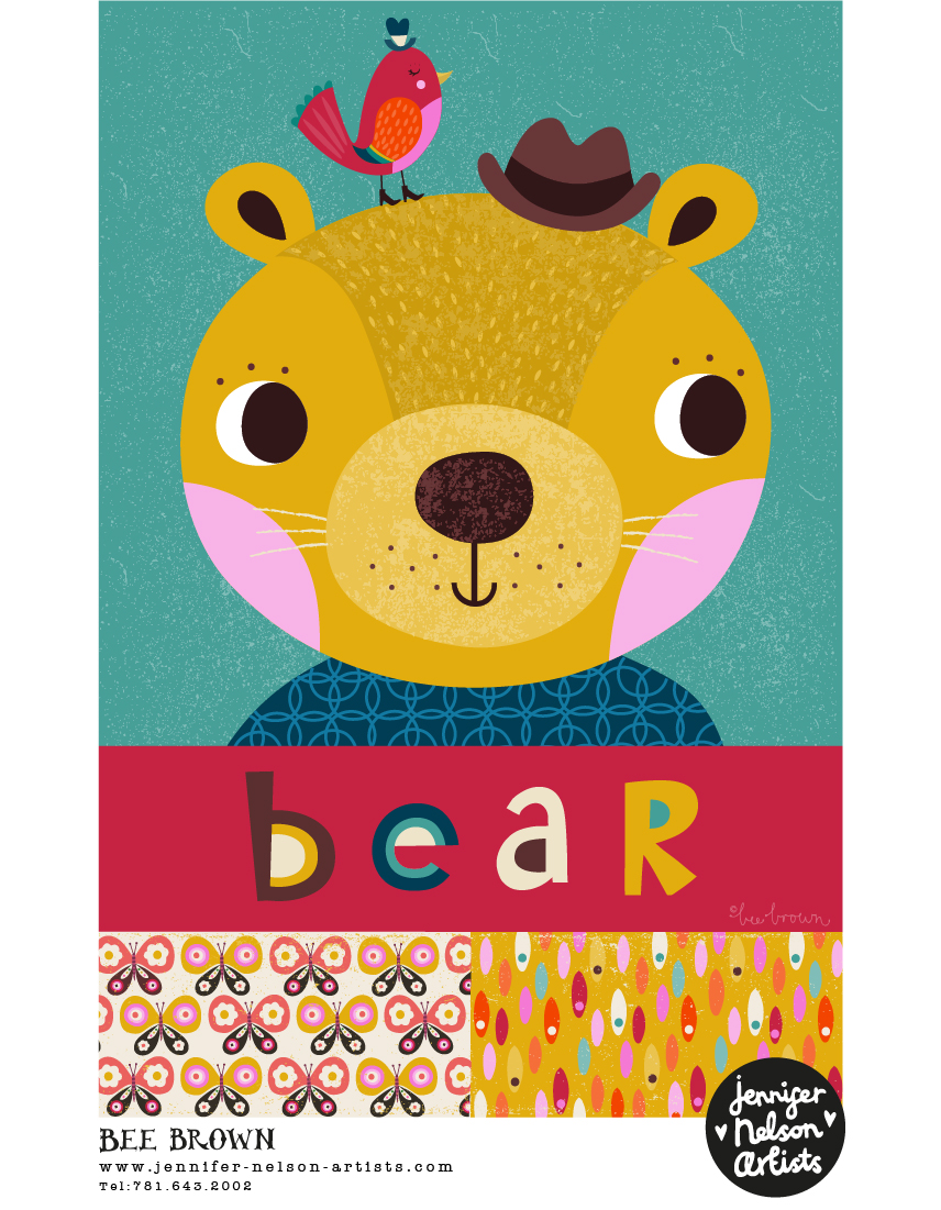
Bee buzzes into SURTEX 2015!

This week, I am counting down the (6!) days until SURTEX by featuring sneak peeks of each artist's work.

We start with Bee, her delightful wit and innate design sense. Clients are eating up her yummy color palettes., with licenses and commissions for wall art, stationery, books, little girl's dresses and *maybe* even fabrics! Once again, I am counting my lucky stars! This girl is on fire! I am thinking product development is next! Here's some eye candy for you! Visit Bee's updated portfolio today!  - Jennifer

Folky Fish

A few weekends ago we visited an exhibition of British folk art at a gallery not too far from where we live, and happened upon some amazing pieces of incredible folk art. I just LOVE folk art. There was so much to see and enjoy. I would have loved to have been able to show you some of the things we saw in more detail but sadly we weren't allowed to take photos. I was really inspired by some 3D wooden carvings of fish that used to hang over shop doors (before proper signage was invented) to let passers by know that particular establishment was the fishmonger's. There were huge boots for the cobblers, an enormous padlock and keys for the locksmiths and a beautiful golden teapot for the tea shop. Here's a quick sketch of some of my fish... watch this space because I'm sure they'll be featured in a pattern pretty soon! Enjoy - Bee

Although the exhibition is closed now, you can still find out more here